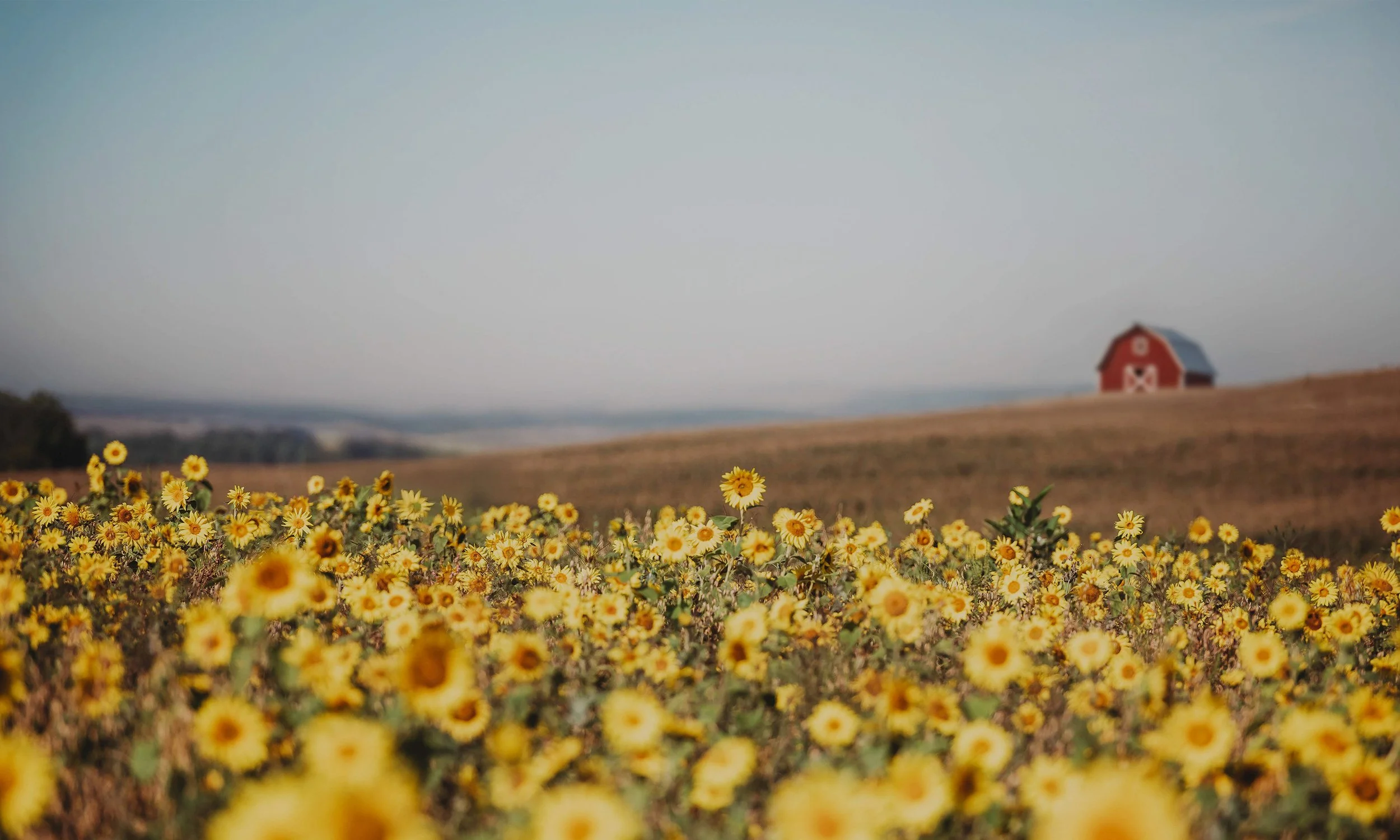
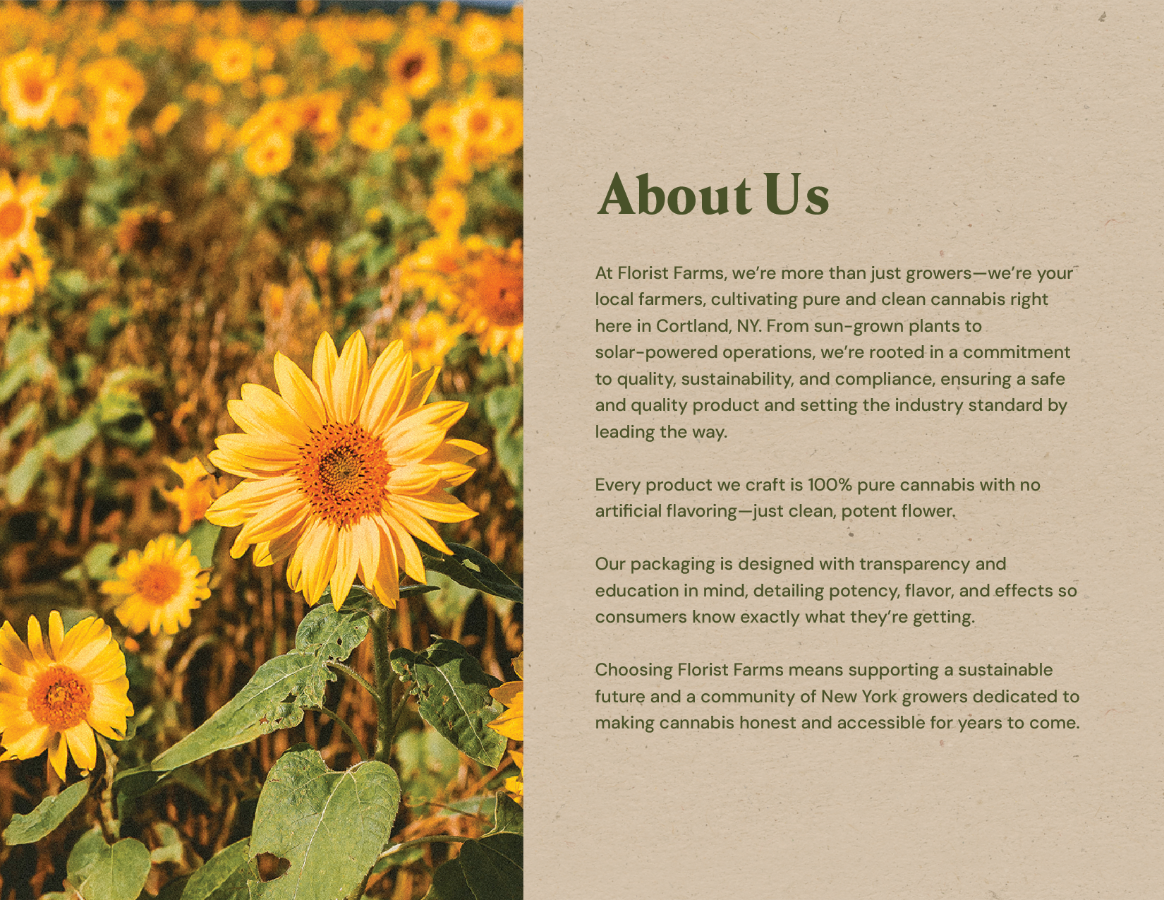
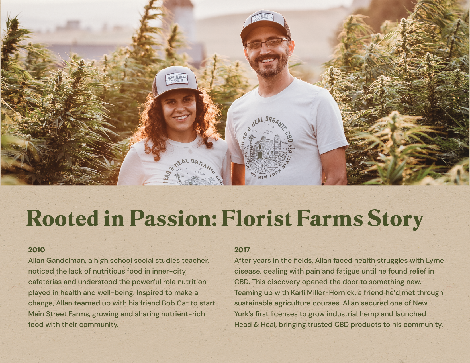
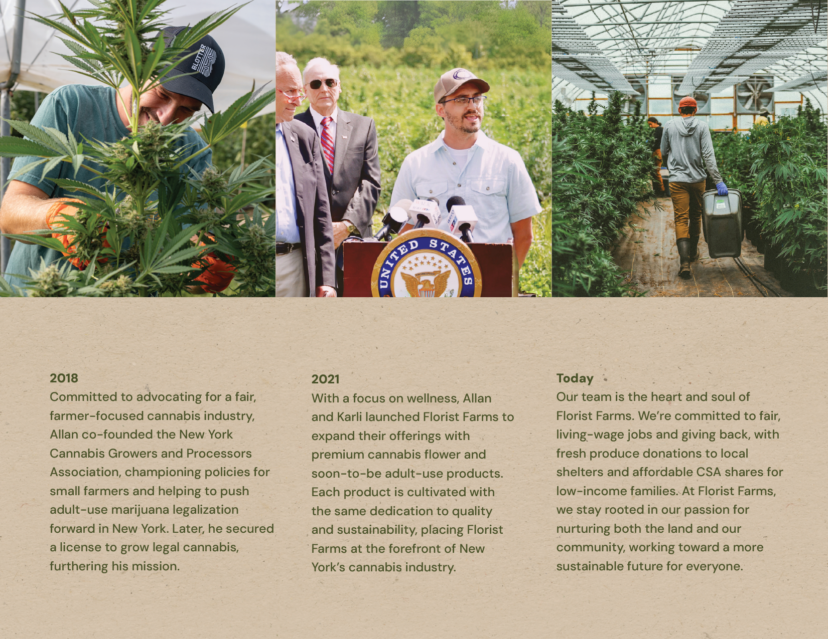
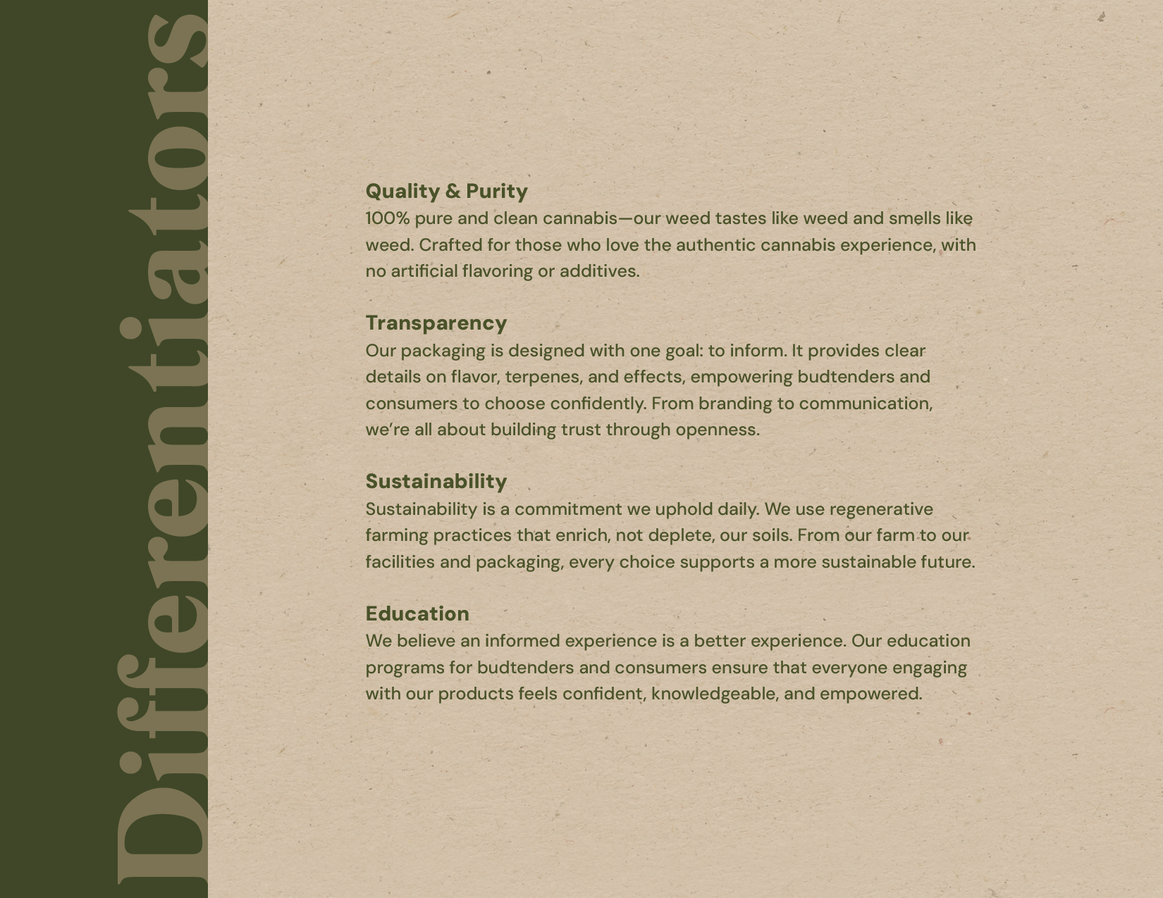
Florist Farms is a farmer-first cannabis brand rooted in Central New York. Built on transparency, quality, and respect for the plant, the brand needed structure to support its rapid growth.
I led the creative direction across brand, packaging, merchandising, and marketing, bringing clarity to a system that was scaling fast and often messy.
Client: Florist Farms
Industry: Agriculture, Cannabis
Sector: B2B, B2C
Roles: Art Direction, Creative Strategy
Company: Farmer Group
Creative Direction
At Florist Farms, I owned the creative vision from the ground up. That meant balancing speed with consistency while supporting a growing product line and sales team.
A lot of the work became about putting structure in place such as defining how the brand shows up, creating a more reliable approach to packaging, and making sure the visuals held together across different touchpoints.
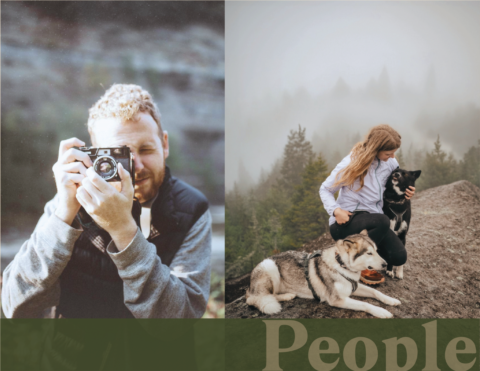
I worked closely with sales, operations, and compliance to keep things aligned, while also leading both internal designers and external partners. From product and lifestyle photography to day-to-day creative output, the focus was on making the work more cohesive and easier to manage as things scaled.
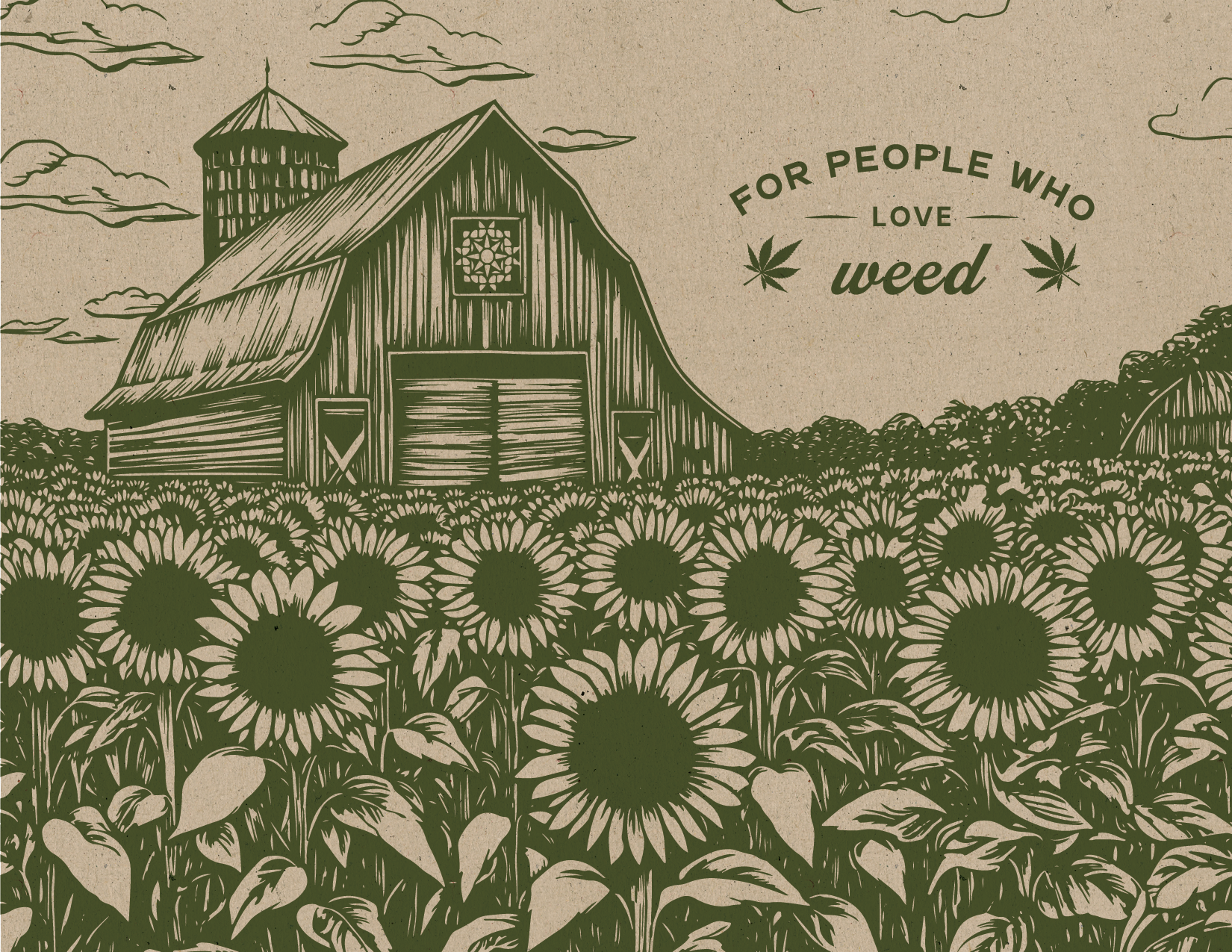
Evolving the Brand
The brand had strong roots, but it lacked consistency. I focused on making the visual identity more intentional and scalable, while still staying true to its farmer-first personality. From packaging to merchandising to digital, the goal was simple: make everything feel like it belongs together. As a result, the team moved away from one-off solutions and toward a more shared understanding of how the brand should look and feel.
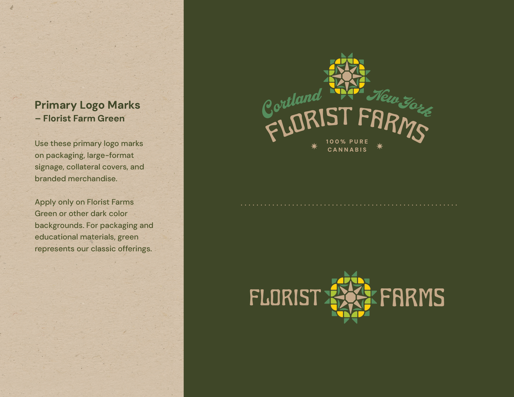
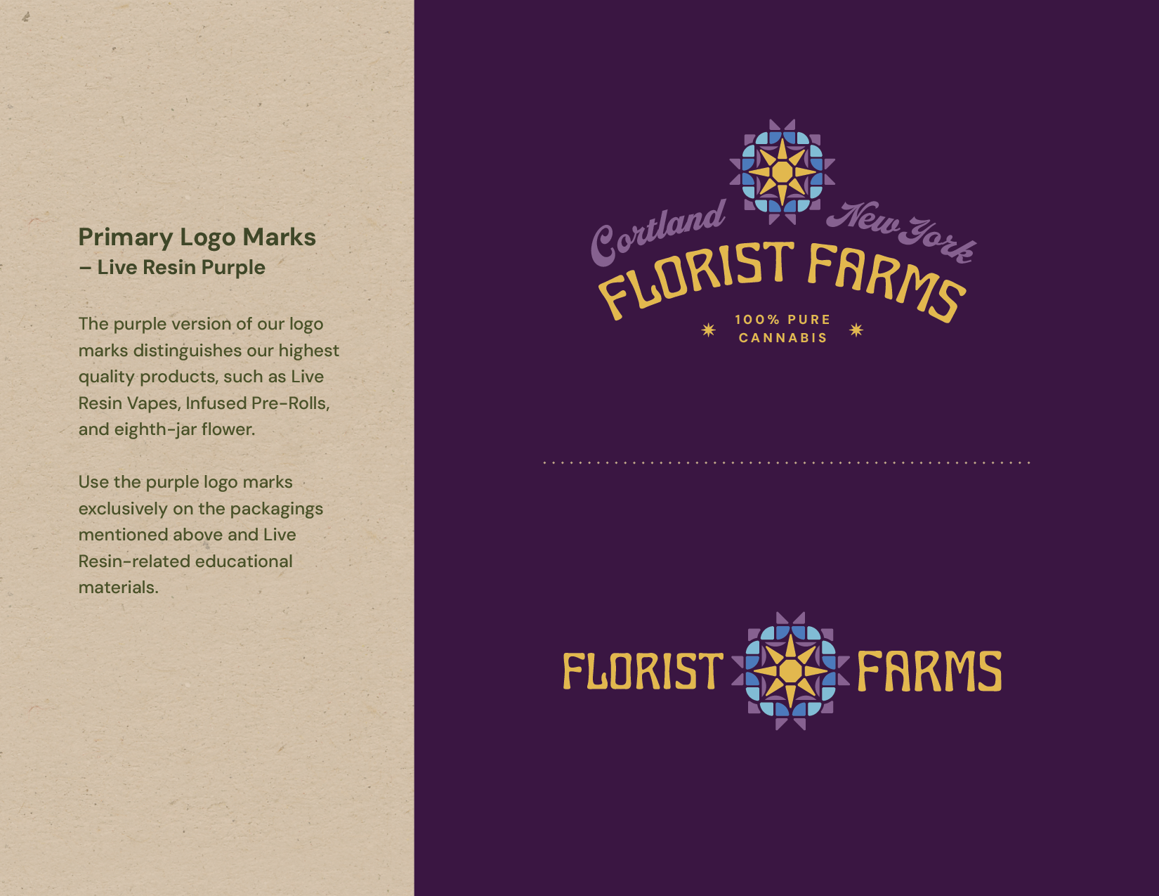


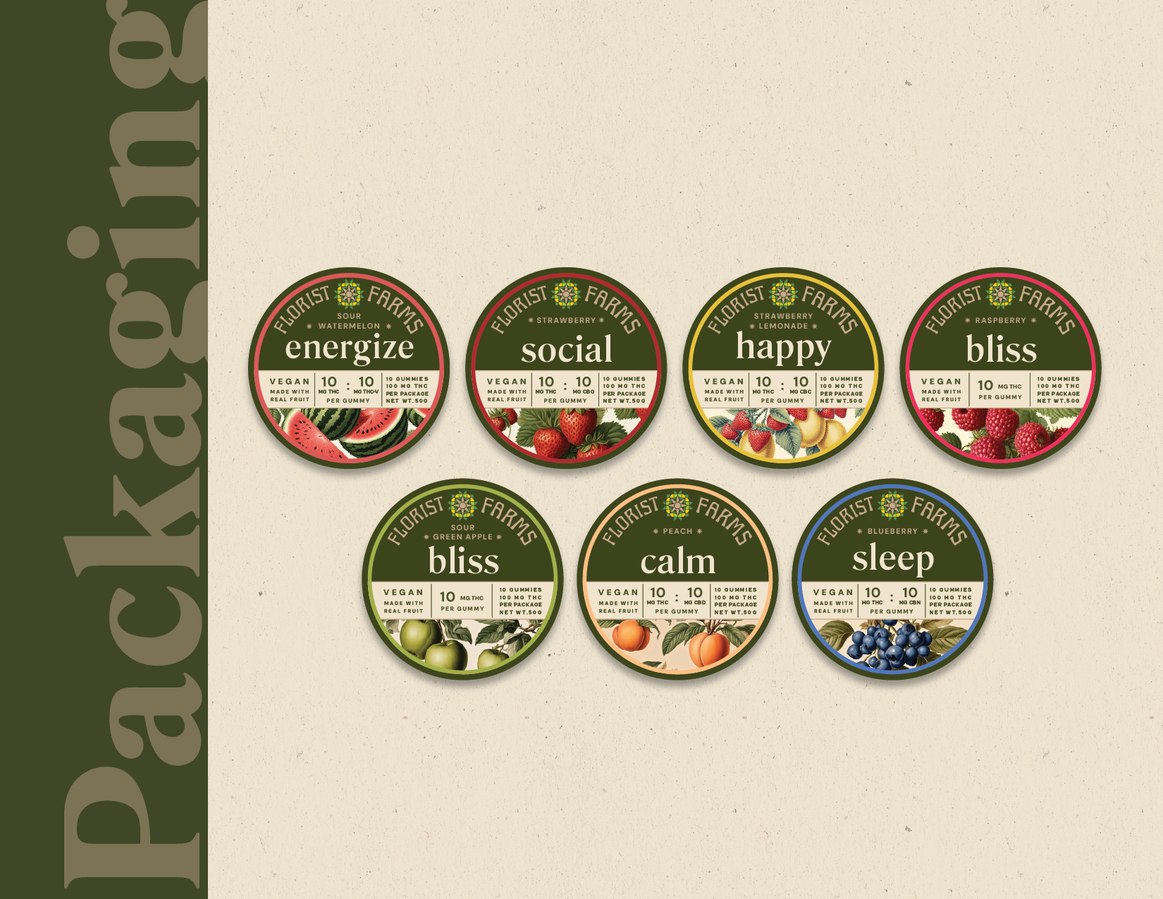
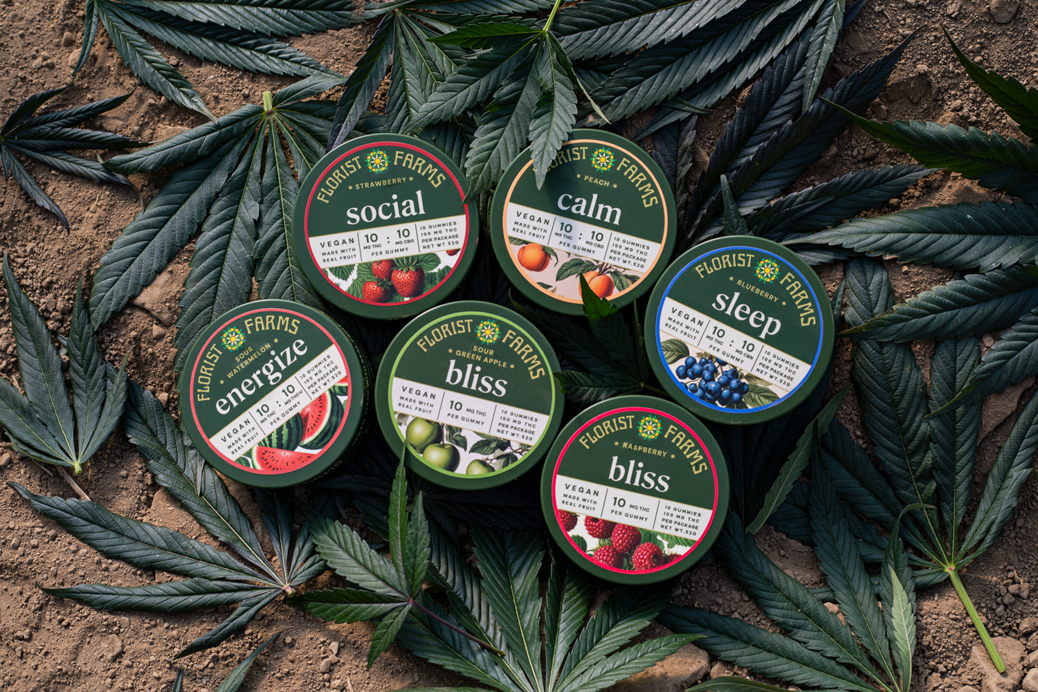
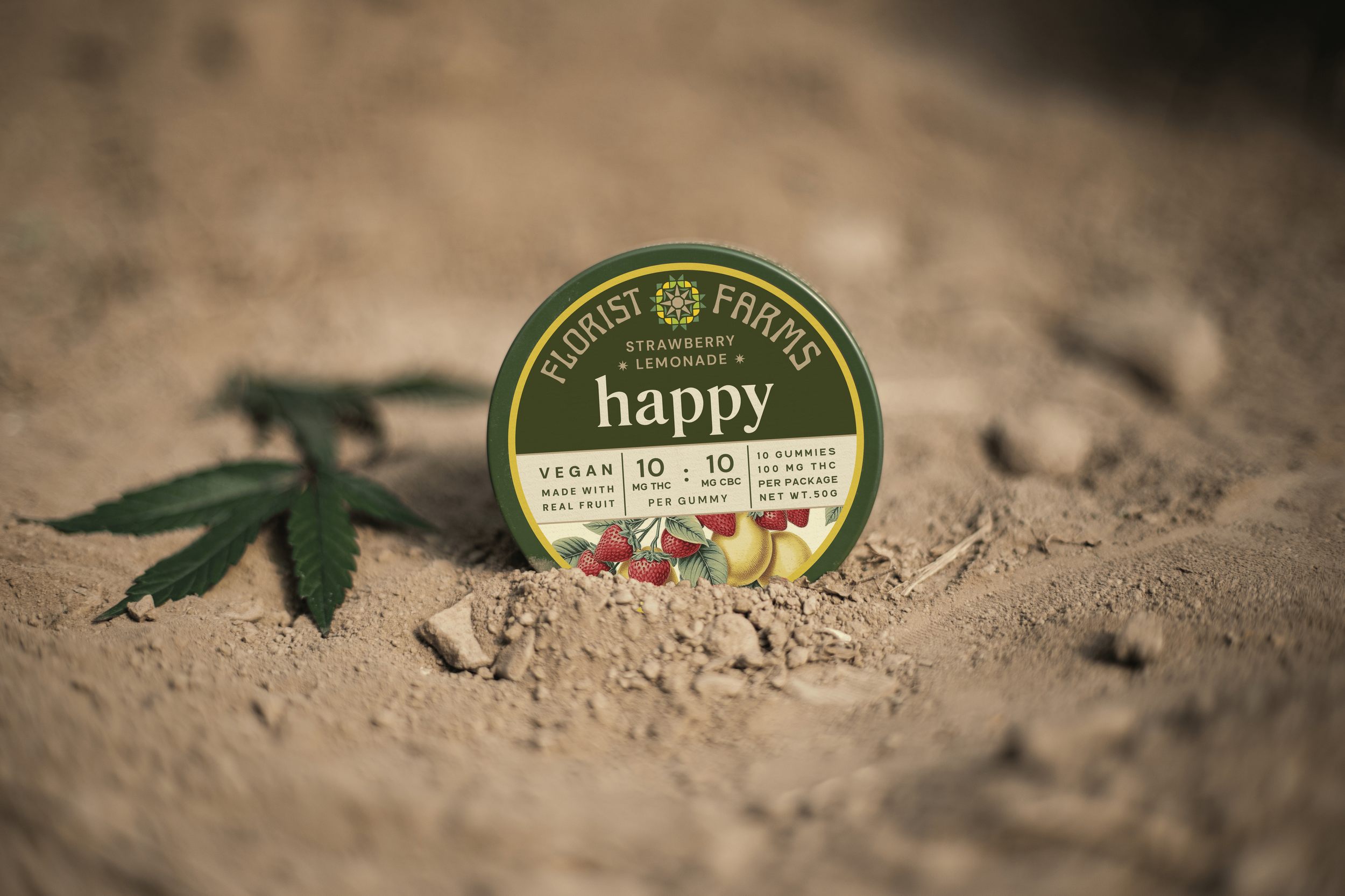
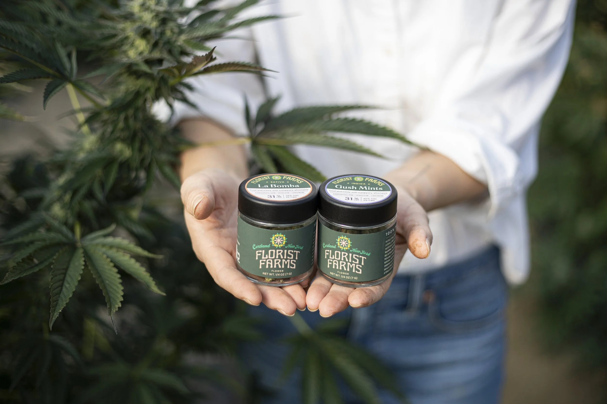
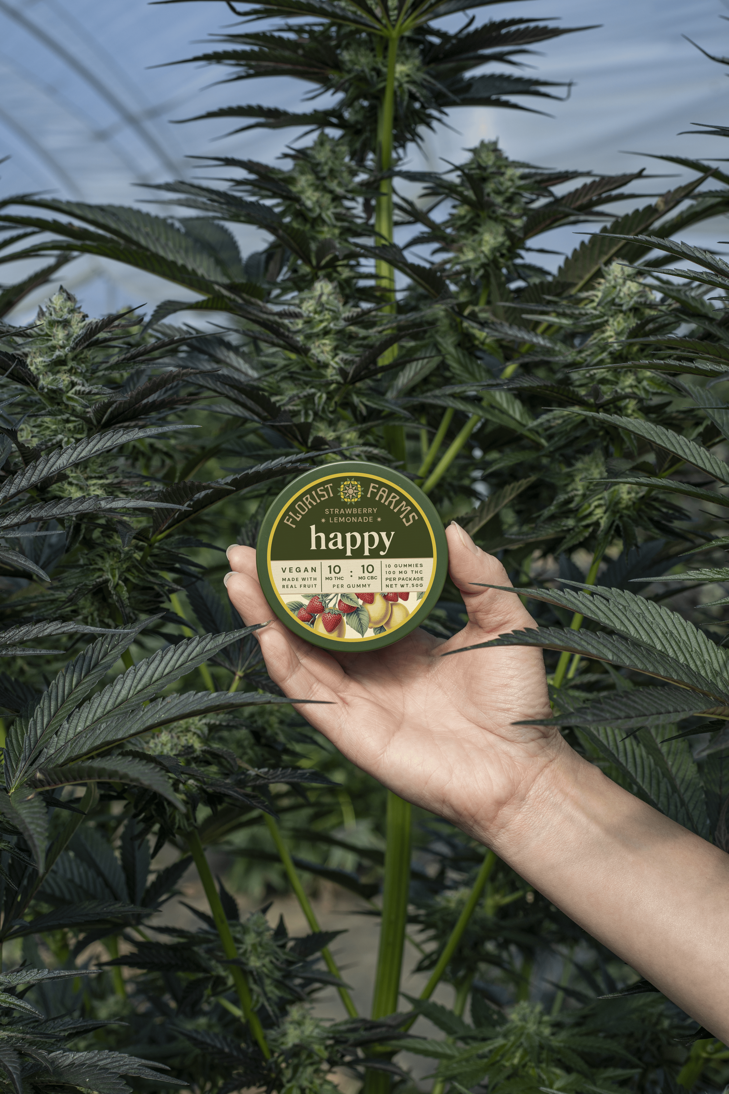
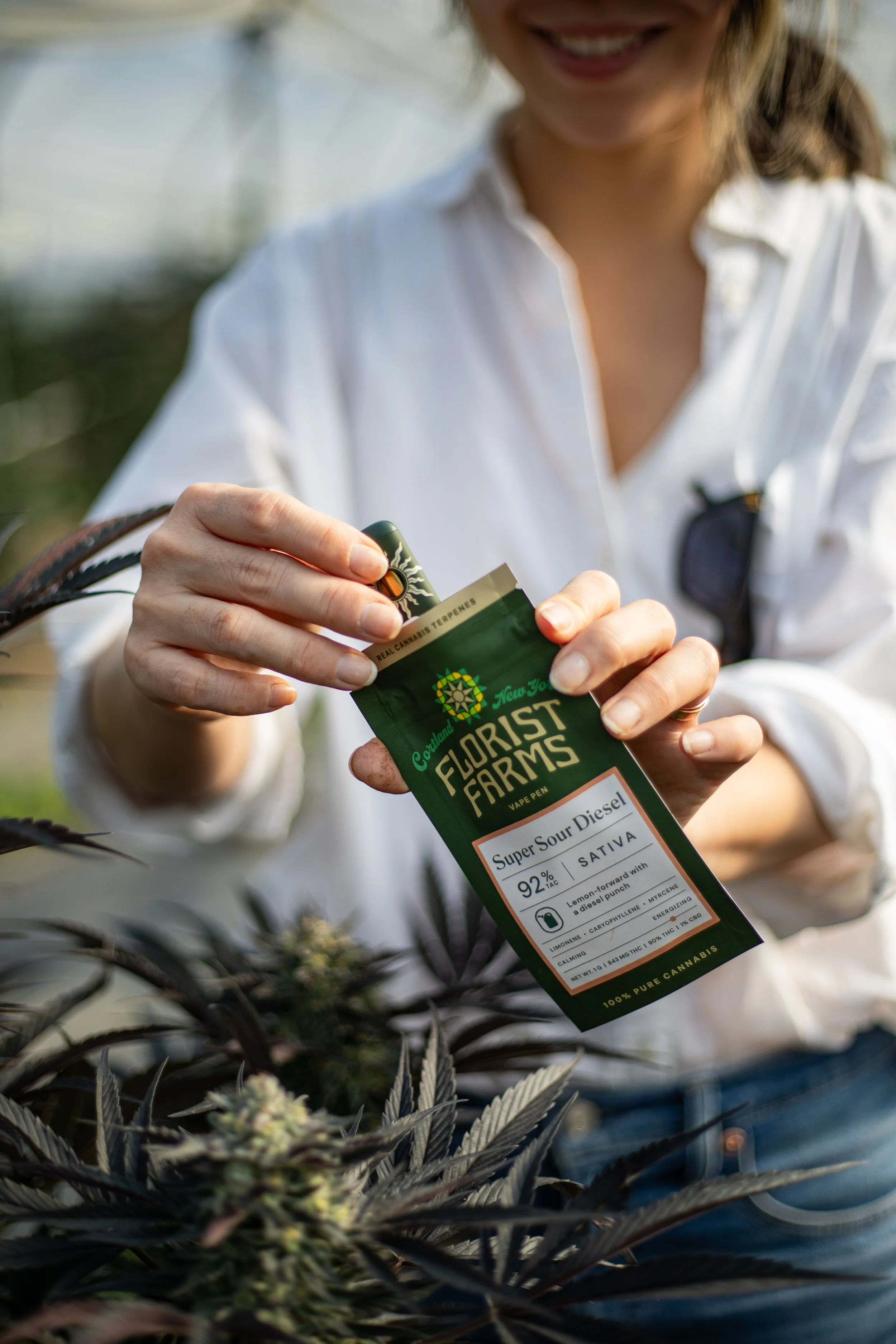
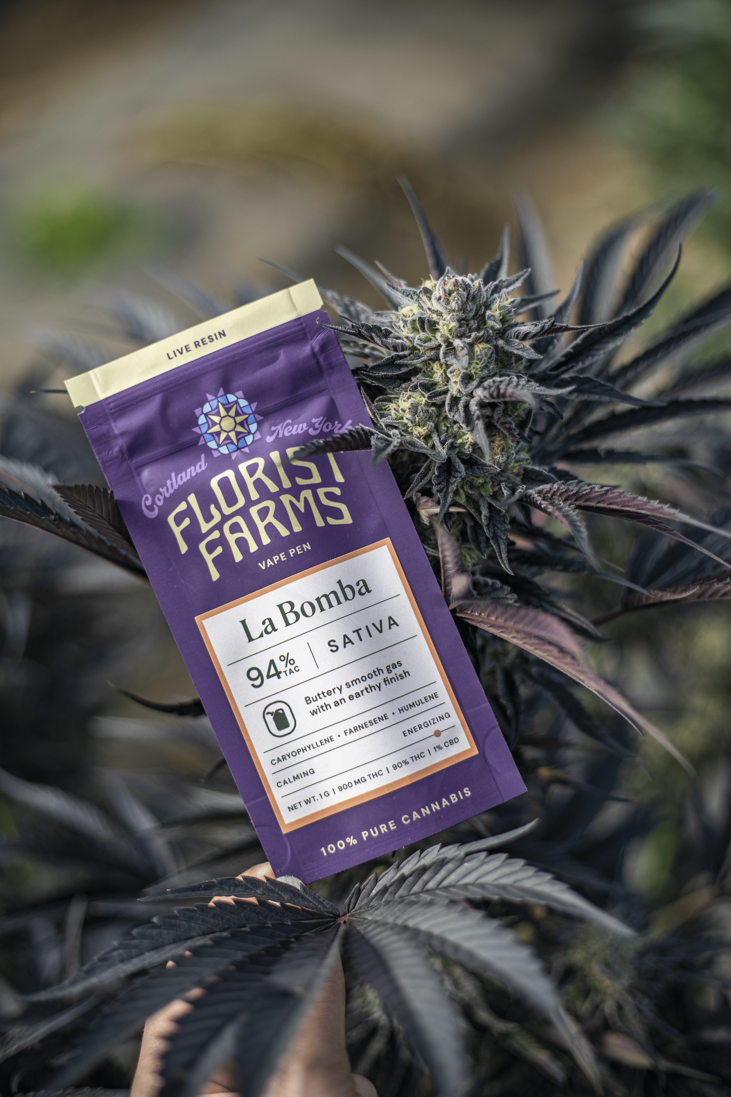
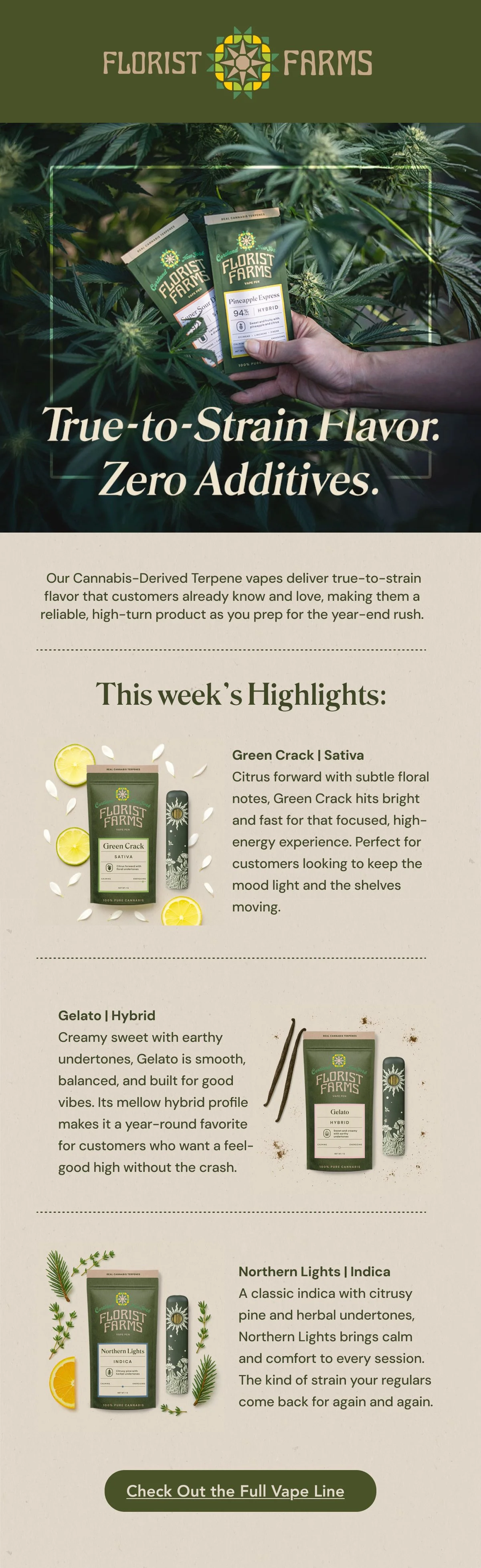
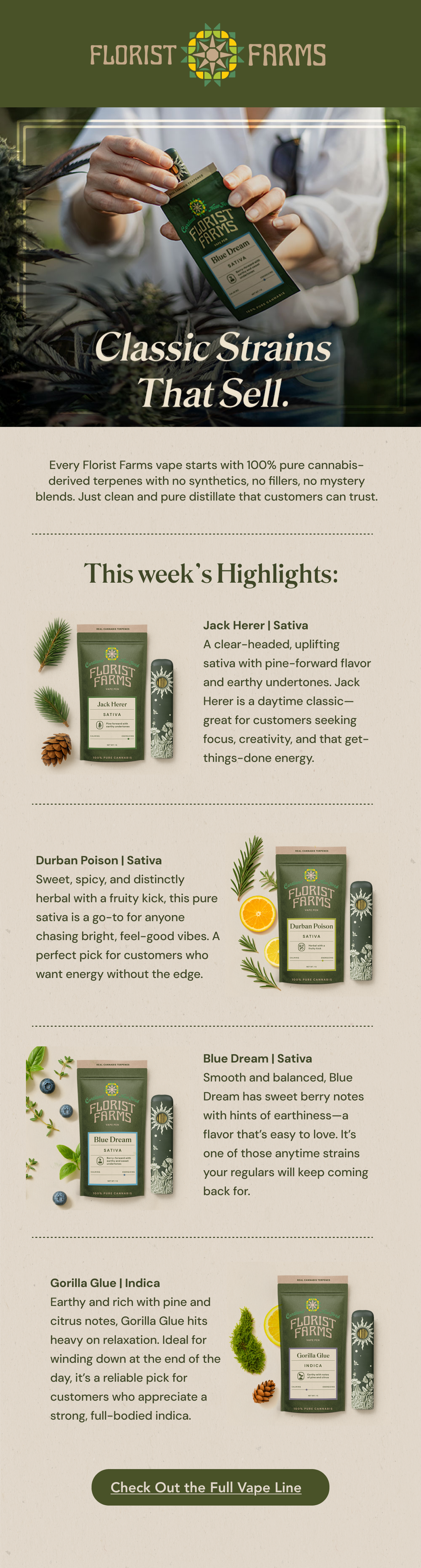
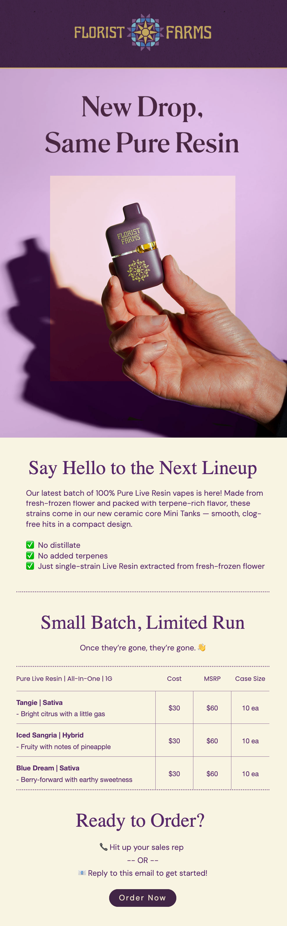
Packaging System
With a fast-growing product line and strict compliance requirements, we needed a system that was both flexible and controlled, hence a framework that:
Shared layouts and rules across product lines
Fewer errors and less back-and-forth
Faster turnaround when new products came in


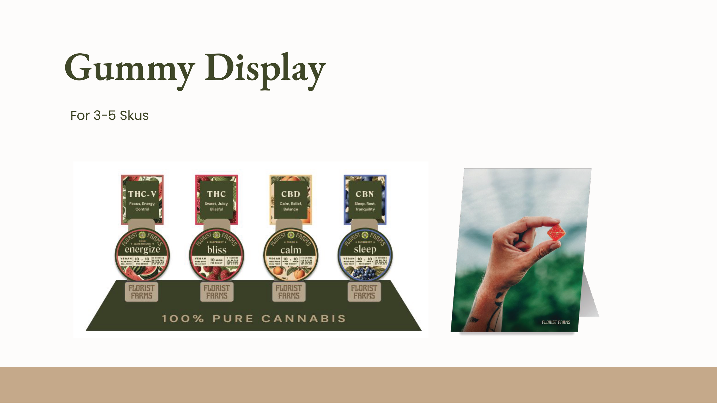
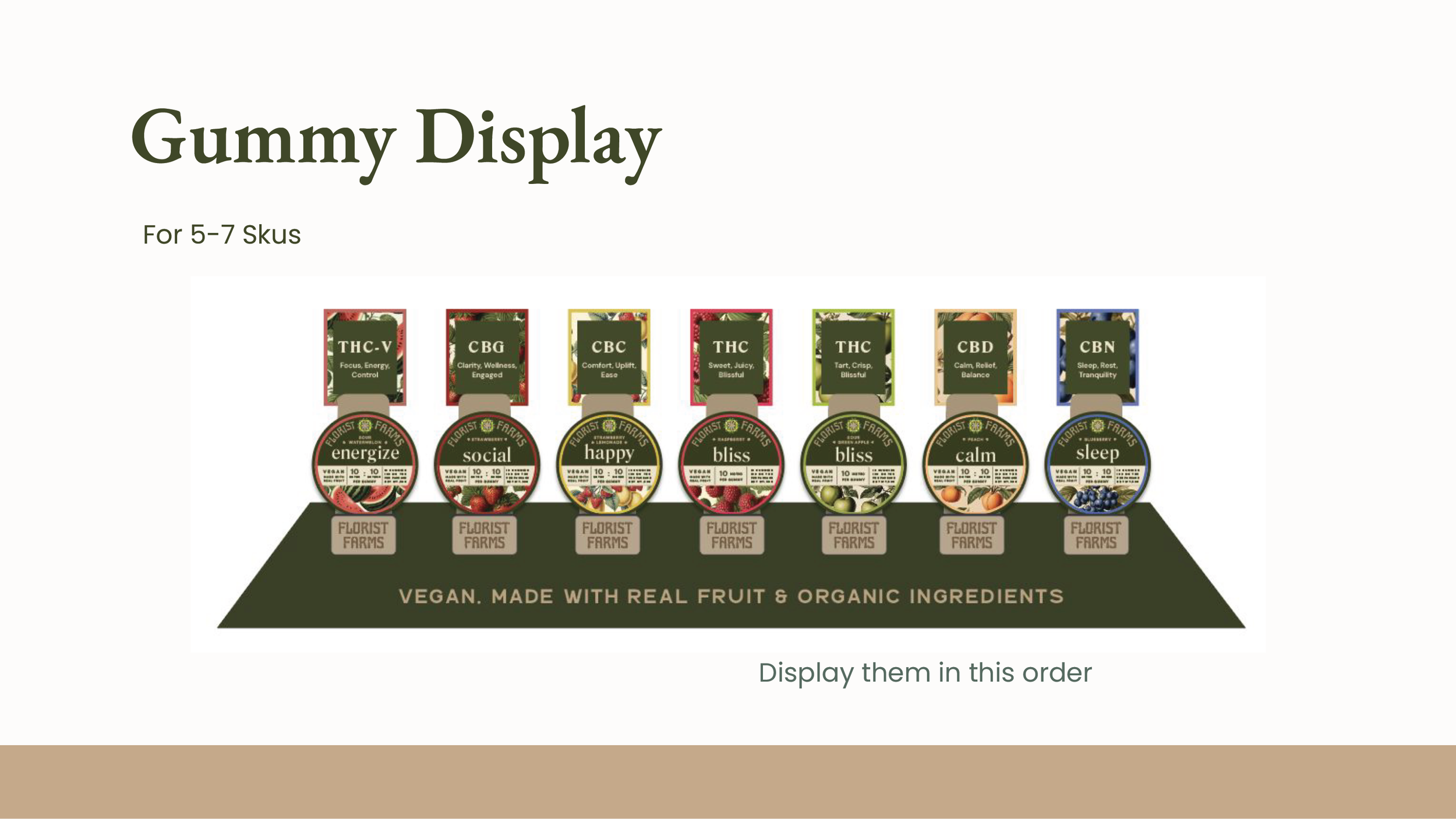
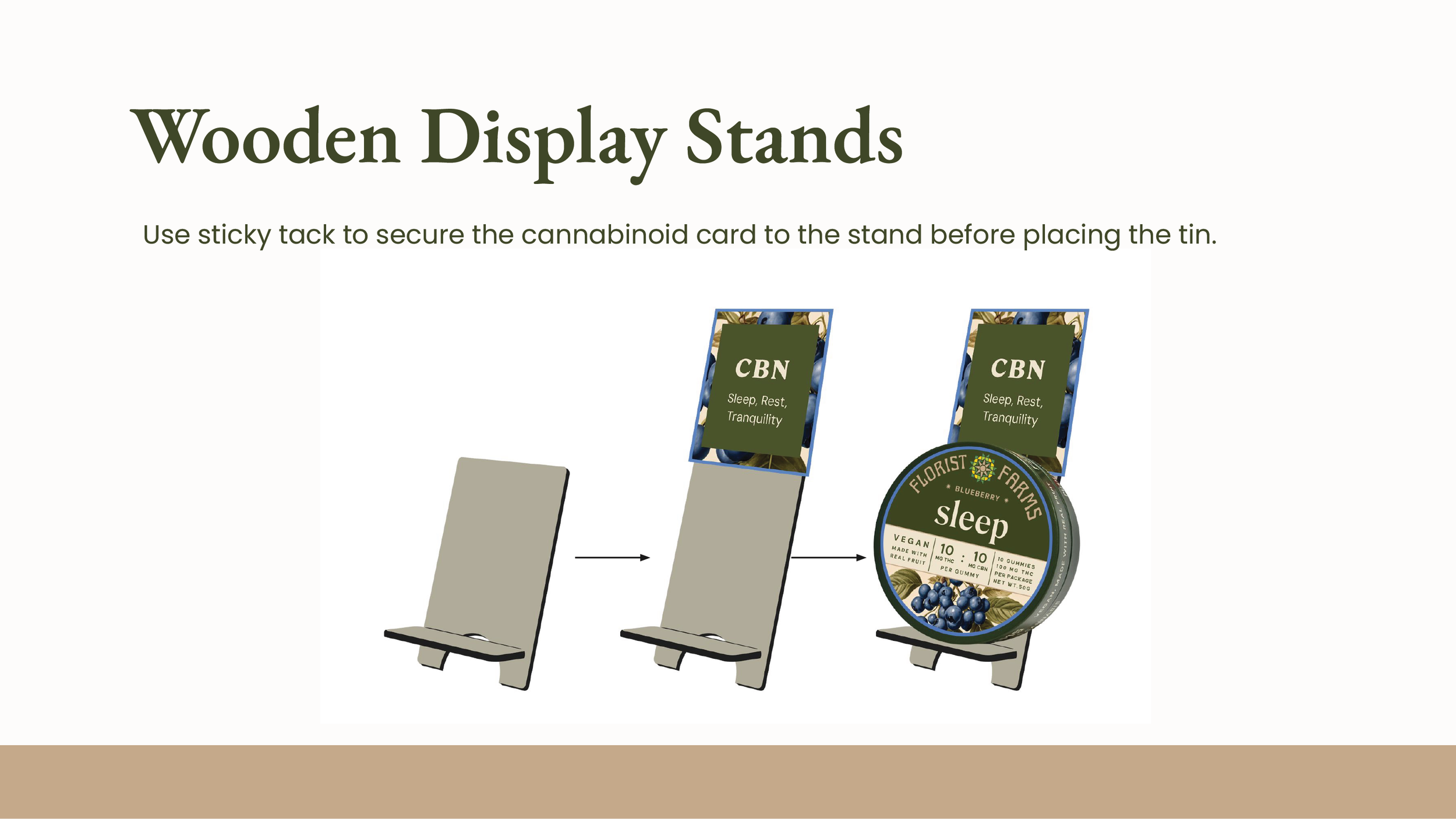
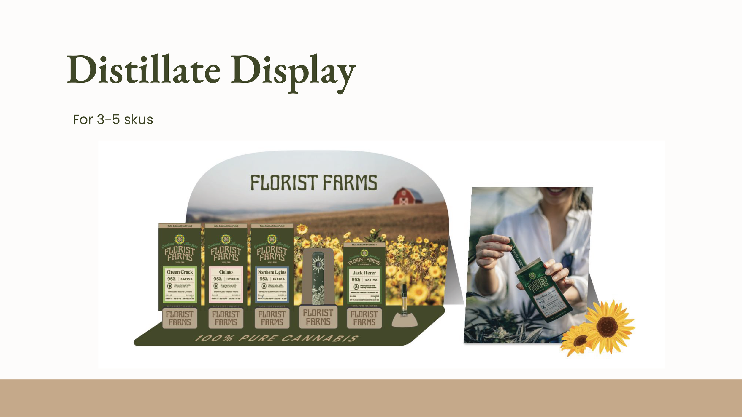
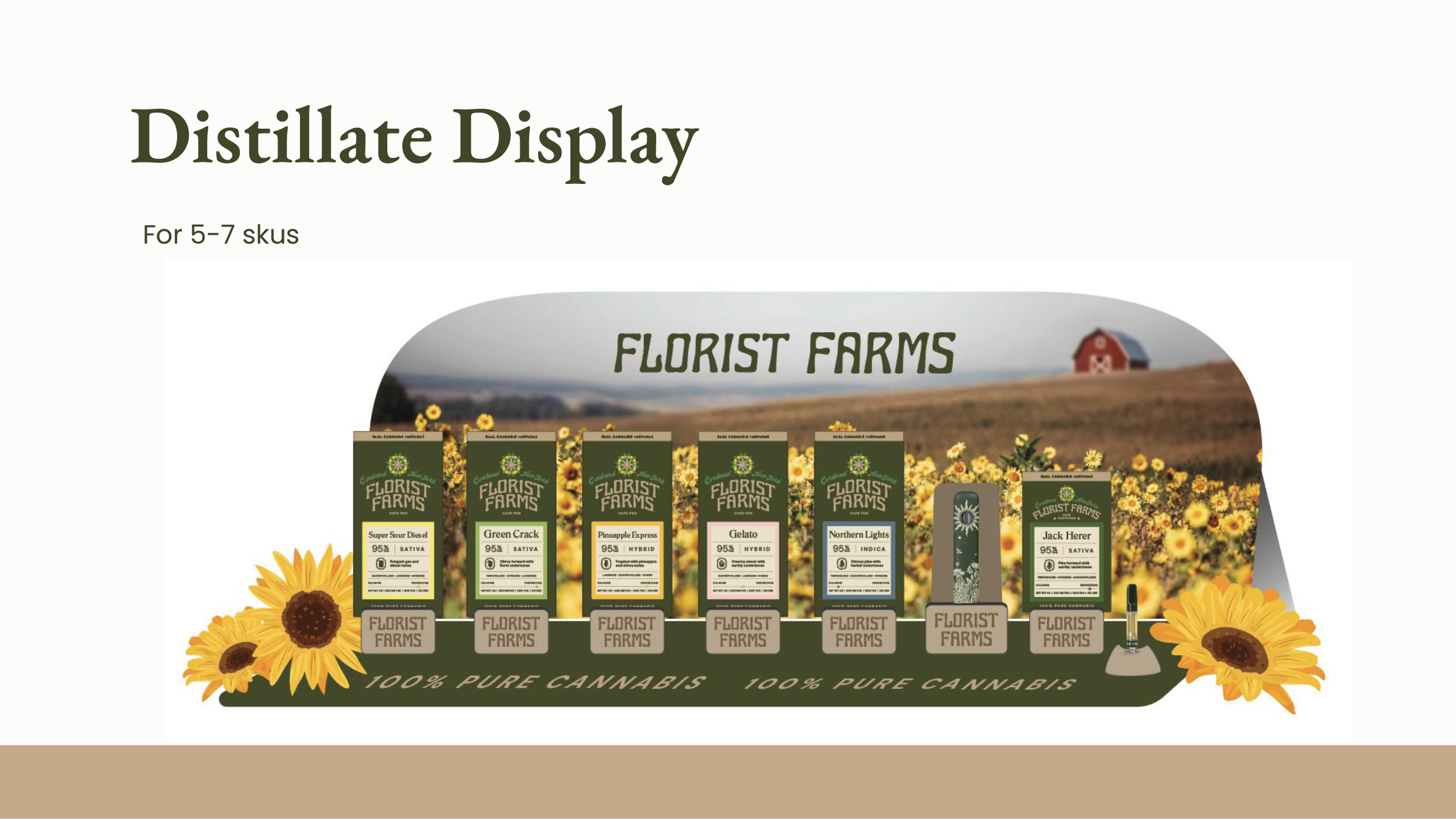
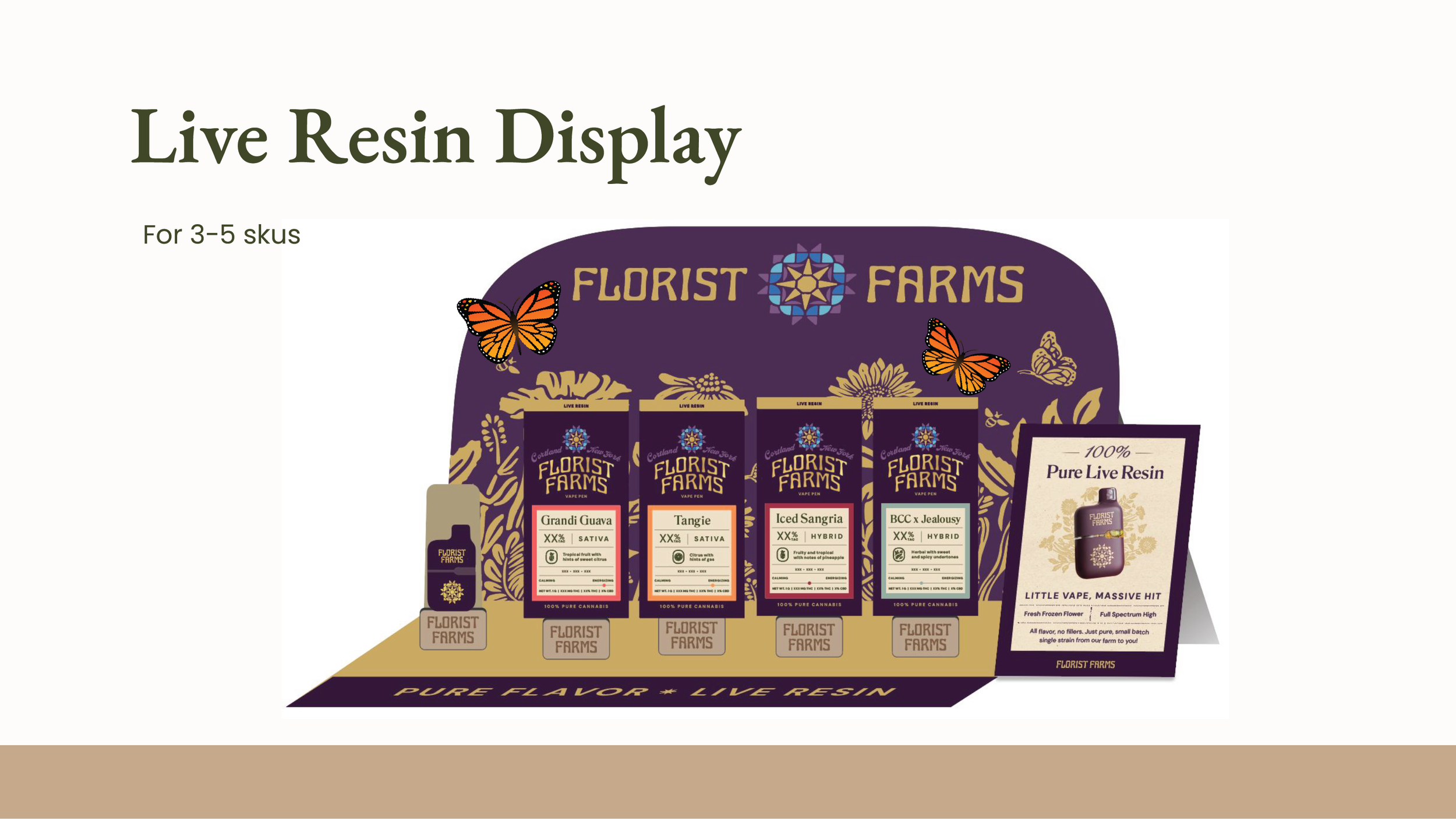
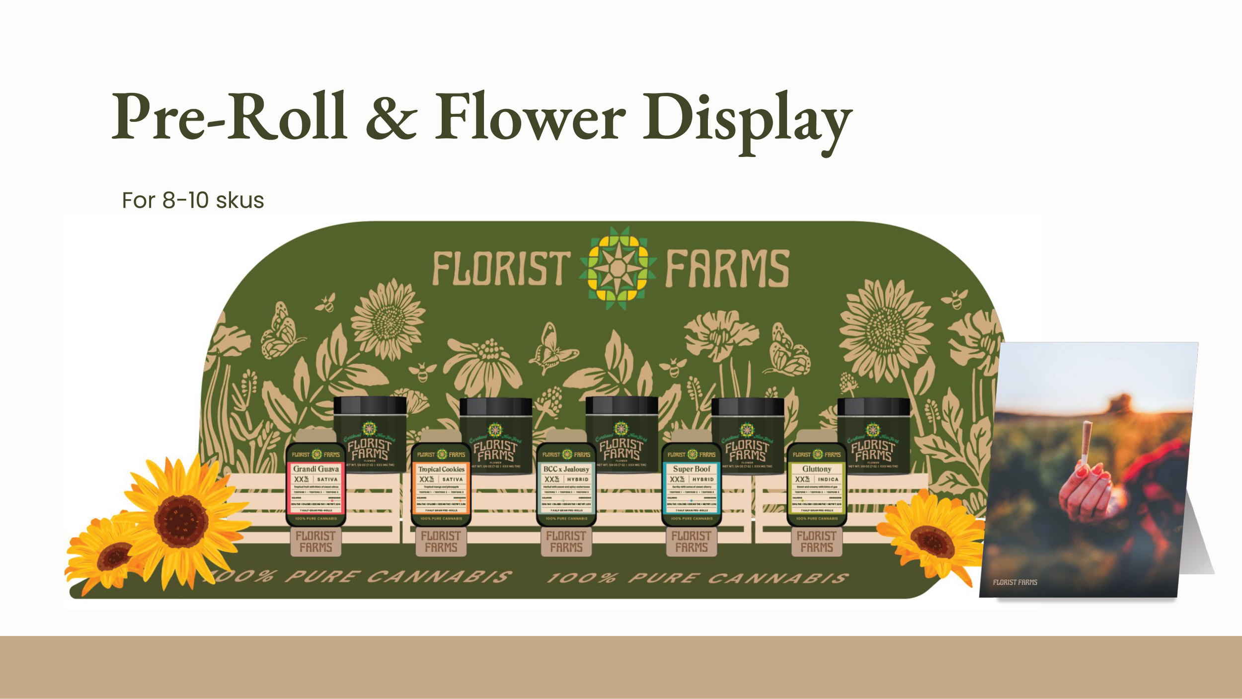
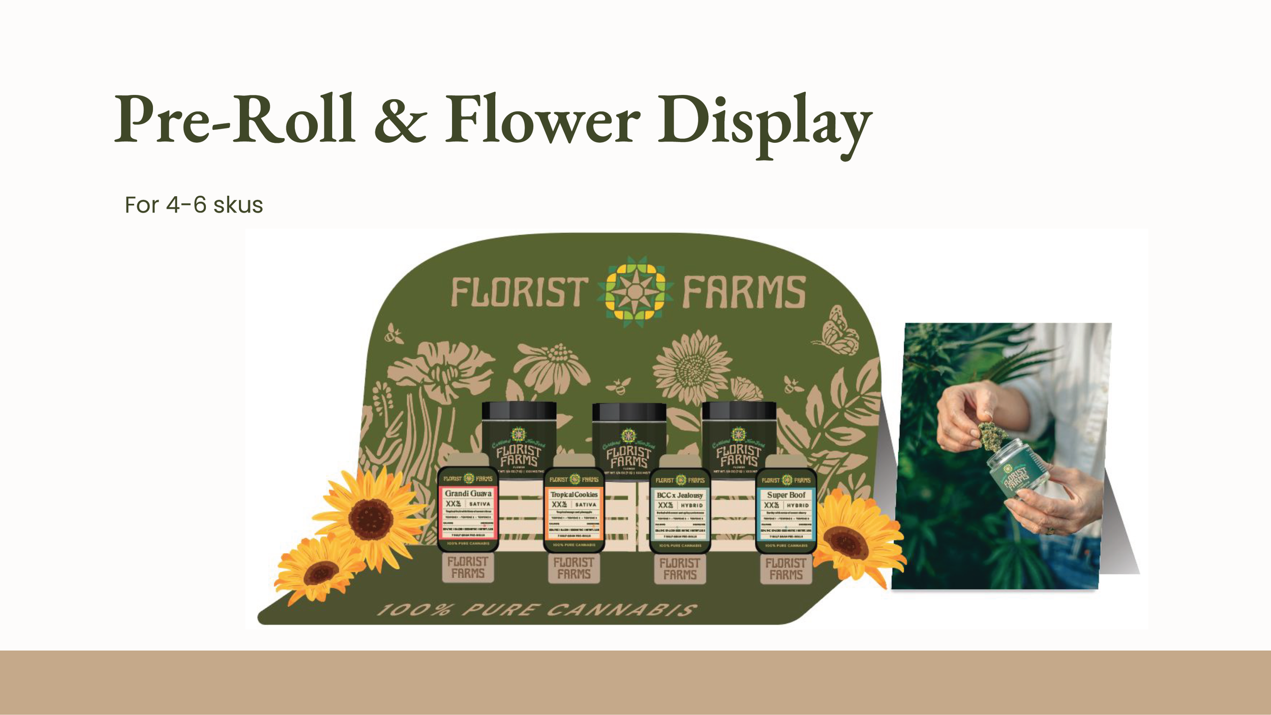
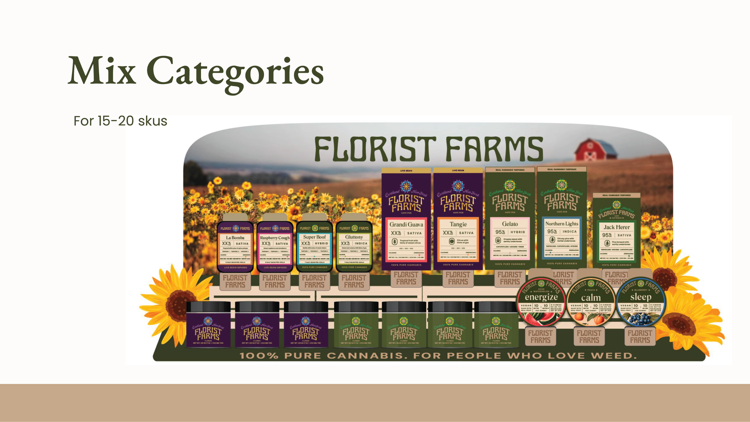
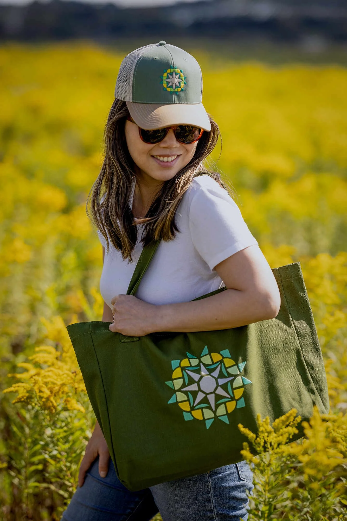
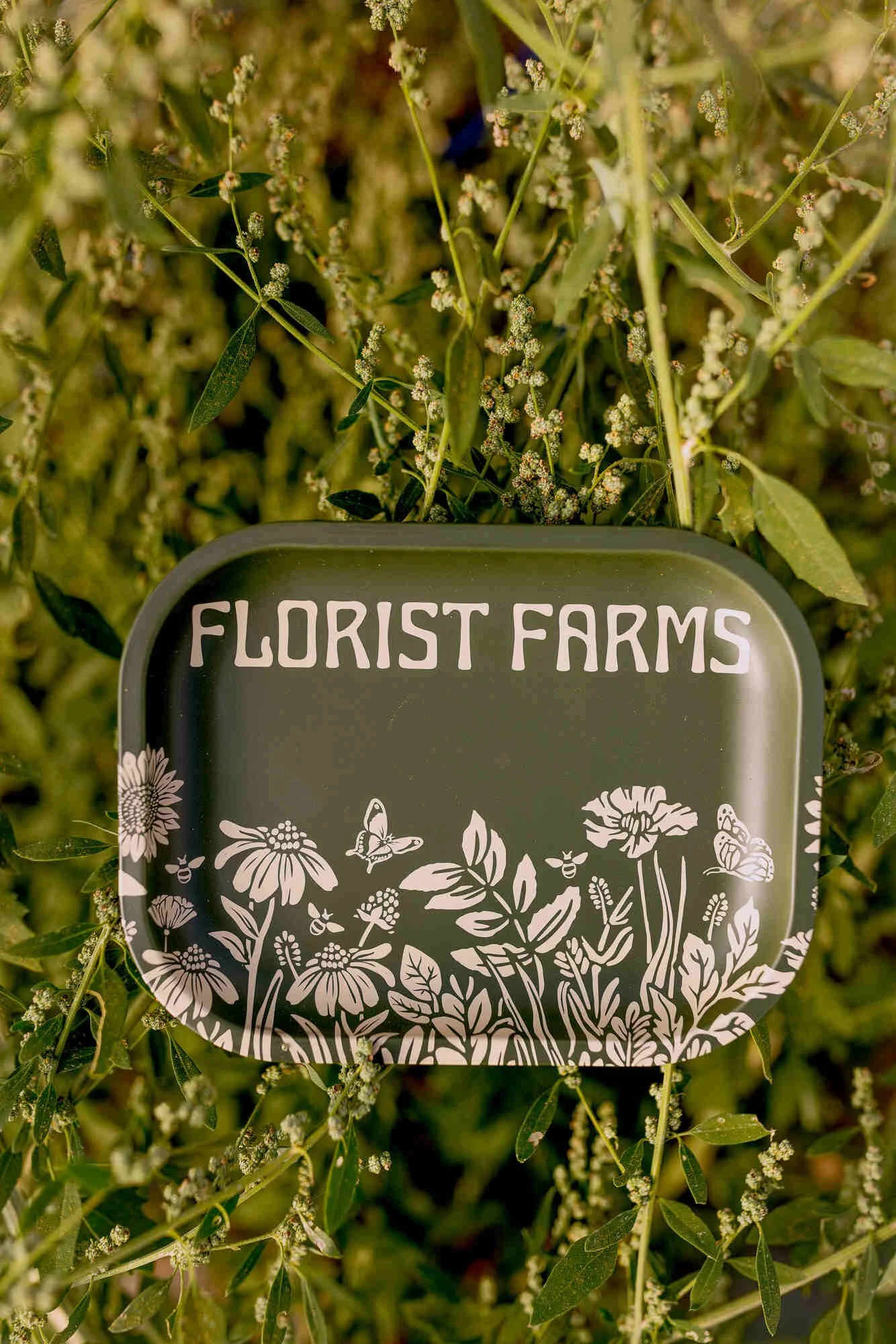
Merchandising & Swag
Merchandising and swag weren’t just “nice to have,” they were a brand extension, critical to the industry. I pulled the various displays into a more cohesive system, so they are executable by our Field Marketing Manager. The goal wasn’t to make more things, but to make the right things with consistency.
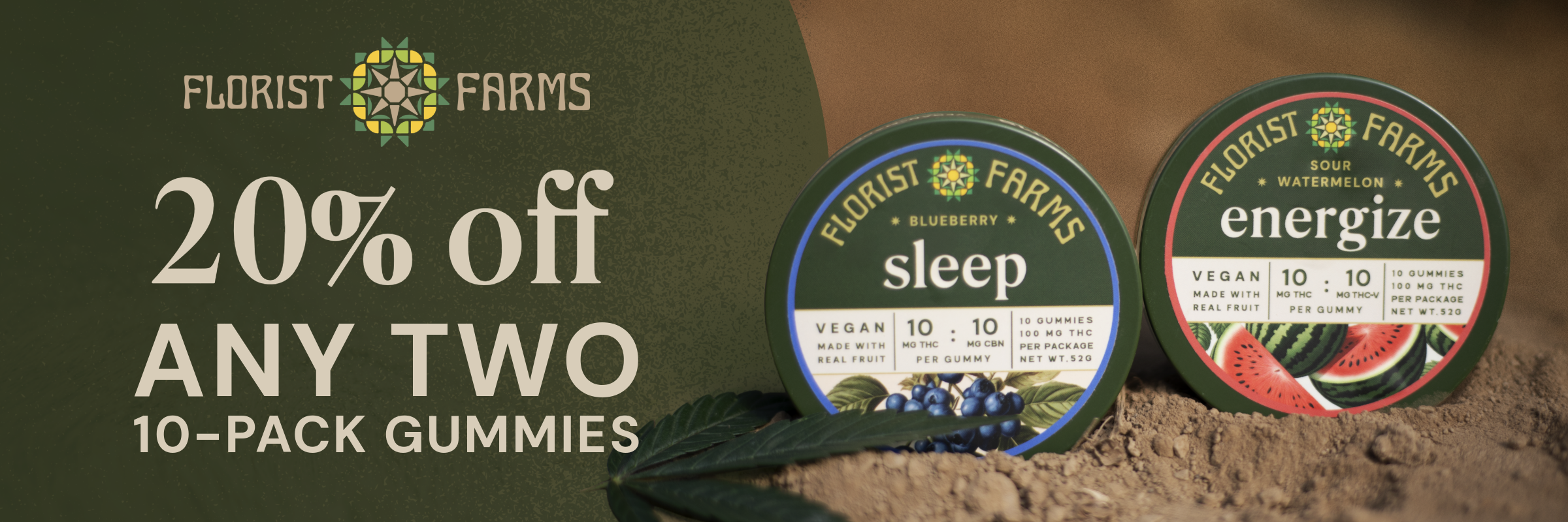
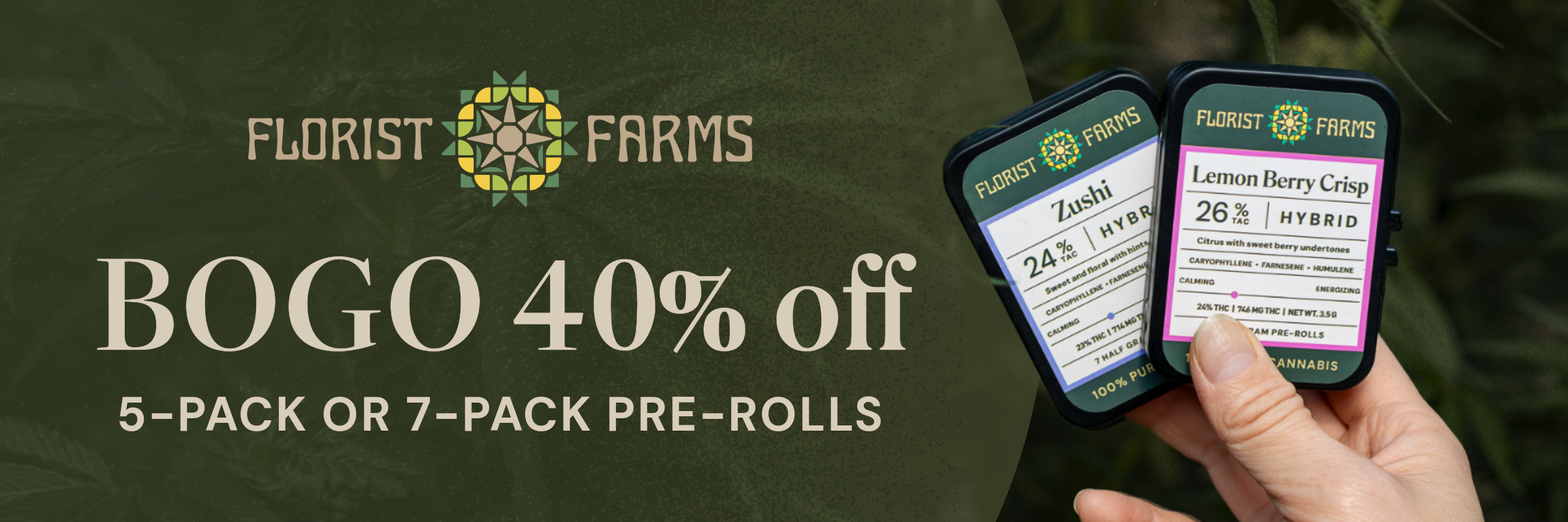
Digital Marketing
Digital needed to feel just as cohesive as everything else. I helped simplify how product information was presented so it was easier to understand at a glance. By doing so, we supported the sales team with assets that actually helped move product.
At its core, this work was about bringing clarity to the brand, the team, and the way things get made. By building systems, aligning teams, and defining the brand more clearly, the work became more intentional and scalable.